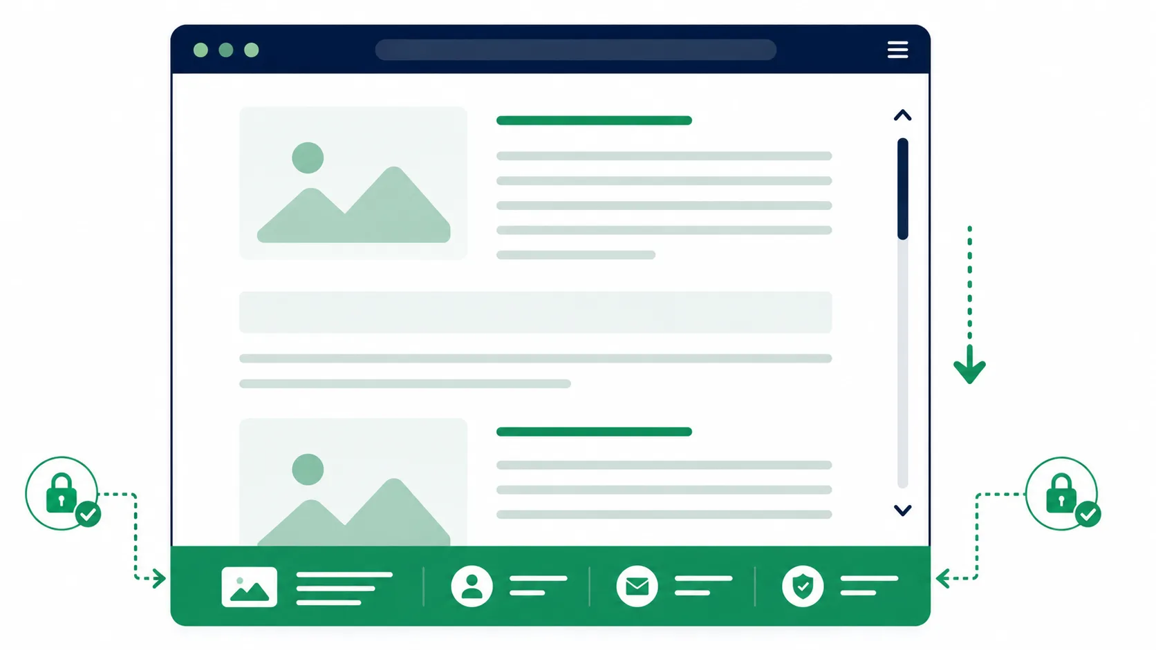
How to Create a Fixed Footer with CSS
A fixed footer stays pinned to the bottom of the browser window regardless of how far the visitor scrolls — useful for persistent calls-to-action, cookie consent banners, a sticky “Add to Cart” bar on a product page, or app-style bottom navigation. This guide covers the working CSS, two real problems the basic version silently causes, and how to add it cleanly in a WordPress theme.
The Basic CSS
The core technique is position: fixed anchored to the bottom of the viewport:
<style>
.site-fixed-footer {
    position: fixed;
    left: 0;
    bottom: 0;
    width: 100%;
    z-index: 999;
    background-color: green;
    color: white;
    text-align: center;
    padding: 12px 0;
}
</style>

<footer class="site-fixed-footer">
    <p>Footer</p>
</footer>
Note: The corrected version uses a semantic <footer> element instead of a generic <div>. Semantic HTML elements give assistive technology and search engines a clearer signal about the page’s structure — a screen reader can jump directly to a <footer> landmark, which it can’t reliably do with an unlabeled <div>.
Warning: Two Problems the Basic Snippet Doesn’t Mention
1. Missing z-index. Without an explicit z-index, a fixed footer can end up hidden behind other positioned elements on the page (a modal, a sticky header, a WooCommerce mini-cart dropdown) purely based on their order in the HTML and their own stacking contexts. Setting z-index: 999 (or higher, if your theme uses very high z-index values elsewhere) as shown above keeps the footer reliably on top.
2. The footer overlaps your page content. This is the one almost every “fixed footer” tutorial skips. A position: fixed element is taken out of the normal document flow entirely — the browser doesn’t reserve any space for it, so your actual last section of content ends up hidden underneath the footer bar. Fix this by adding bottom padding to your page’s main content wrapper, matching the footer’s rendered height:
body {
    padding-bottom: 50px; /* match this to your footer's actual height */
}
Note: If your footer’s height changes at different screen sizes (common once you add responsive rules, see below), the padding needs to match at each breakpoint too — a mismatched value here is the most common cause of a fixed footer silently swallowing the last line of a page’s content.
Making It Responsive
A fixed footer that looks fine on desktop can feel intrusive on a small phone screen, where it permanently eats into already-limited vertical space. A common pattern is shrinking the footer, or hiding non-essential content inside it, below a breakpoint:
@media (max-width: 600px) {
    .site-fixed-footer {
        padding: 8px 0;
        font-size: 14px;
    }
    body {
        padding-bottom: 38px; /* match the smaller footer height */
    }
}
Note: On iOS Safari specifically, the browser’s own address bar can shrink and expand as the visitor scrolls, which shifts where “the bottom of the viewport” actually sits and can cause a fixed footer to visually jump. There’s no pure-CSS fix for this quirk — it’s a known platform behavior worth testing for if a sticky footer is central to your design.
Adding It to a WordPress Theme Without Editing footer.php
Rather than hardcoding the markup into your theme’s footer.php (which gets overwritten on a theme update), hook it into wp_footer from a plugin or your child theme’s functions.php — this makes it portable and survives theme changes entirely.
<?php
add_action( 'wp_footer', 'wpwebguru_fixed_footer' );
function wpwebguru_fixed_footer() {
    ?>
    <style>
        .site-fixed-footer {
            position: fixed;
            left: 0;
            bottom: 0;
            width: 100%;
            z-index: 999;
            background-color: green;
            color: white;
            text-align: center;
            padding: 12px 0;
        }
        body {
            padding-bottom: 50px;
        }
    </style>
    <footer class="site-fixed-footer">
        <p><?php esc_html_e( 'Footer', 'wpwebguru' ); ?></p>
    </footer>
    <?php
}
?>
Note: For anything beyond a static text string, prefer moving the CSS into your theme’s stylesheet (enqueued properly with wp_enqueue_style()) rather than an inline <style> block — inline styles printed on every page load can’t be cached by the browser the way an external stylesheet can.
Common Use Cases
- Cookie consent banners that need to stay visible until dismissed.
- Sticky “Add to Cart” bars on WooCommerce product pages — keeping the buy button reachable without scrolling back up, and a natural pairing with our guide on custom quantity plus/minus buttons.
- App-style bottom navigation on mobile-first designs.
- Persistent contact/CTA bars (“Call Now”, “Get a Quote”) on service-based sites.
Wrapping Up
The CSS itself is three lines — position: fixed, bottom: 0, width: 100% — but a genuinely usable fixed footer needs the z-index and content-padding fixes covered above, or it either disappears behind other elements or quietly hides part of your page. Hook it in through wp_footer if you want it to survive theme updates, and always double-check the padding value any time the footer’s height changes at a breakpoint.